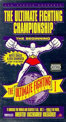
I've been working on the UFC 1 Poster. I decided I would do this first as it will allow me to get an idea of where I'm going with this visually, so I can apply this to the ticket, flyer and envelope products.
I wanted to reference the original UFC Posters and also take a leaf from Pride FC's book, here are the references.


Another consideration was, this is set before the UFC's first ever event. There will not be any imagery from an event, which hasn't even happened yet. At the same time, I needed some stock imagery I could use for the poster. I was looking for something which gave an indication of what the event was about and also a nod to MMA and UFC's influences. One of which is Vale Tudo fighting, a similar no-holds-barred 'no rules' fight sport.
I used this picture of Rickson Gracie and Rei Zulu in a Vale Tudo contest from the 80s

Poster MUST Include following information:
- UFC 1
- The Beginning
- The No-Holds-Barred Extravaganza!
- The Most controversial event of the decade
- Featuring 8 of the greatest fighters in the world
- There are no rules!
- Venue
- Date
- City
I wanted to also reference prize fighting posters from many years ago to give the UFC event a classic feel, to add legitimacy. Something the UFC struggled with at first. For example this one featuring Muhammad Ali

I also wanted to make it look quite 'corny' as well with the layout and overload of information, something you can probably imagine plastered to a wall in a barbershop. Just everywhere.
Here's what I came up with.

The following two, I tried to make it a little more experimental with the colour, overlaying a gradient over the top. I'm going to print onto the stock, with no background fill. Never liked those! Prefer using the stock as the background with text and cutouts over the top, printing in layers like a screenprint. Just how my references were probably printed. Especially the Ali poster.

Wasn't too sure about the colours on this, might

I actually quite like this, I think it adds maybe a more contemporary experimental twist to something I was designing to look old and retro. I'll keep this approach in mind and maybe apply it to the rest of the branding afterwards to compare.
I went for a long vertical poster as I just thought it'd be cool to reference MMA's roots, in Japan. With a long vertical, scroll like poster. This will fold up vertically and be inserted into the envelope. Like so...


0 comments:
Post a Comment